
Brief
Design a web app for customers to create and manage a booking account for easier repeated bookings, updating relevant medical details and communicating with Roar Agency administrators.
Goals
Role
UI/UX Designer — responsible for designing the interface of the dashboard and user journey for customers.
The Problem
A tedious form which doesn't account for repeat customers
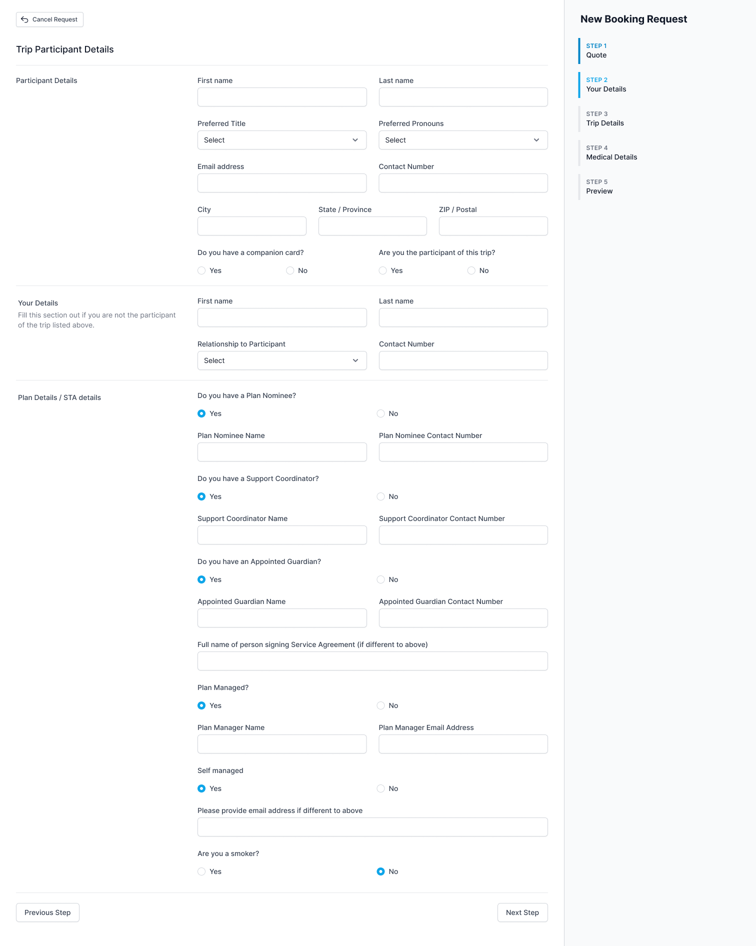
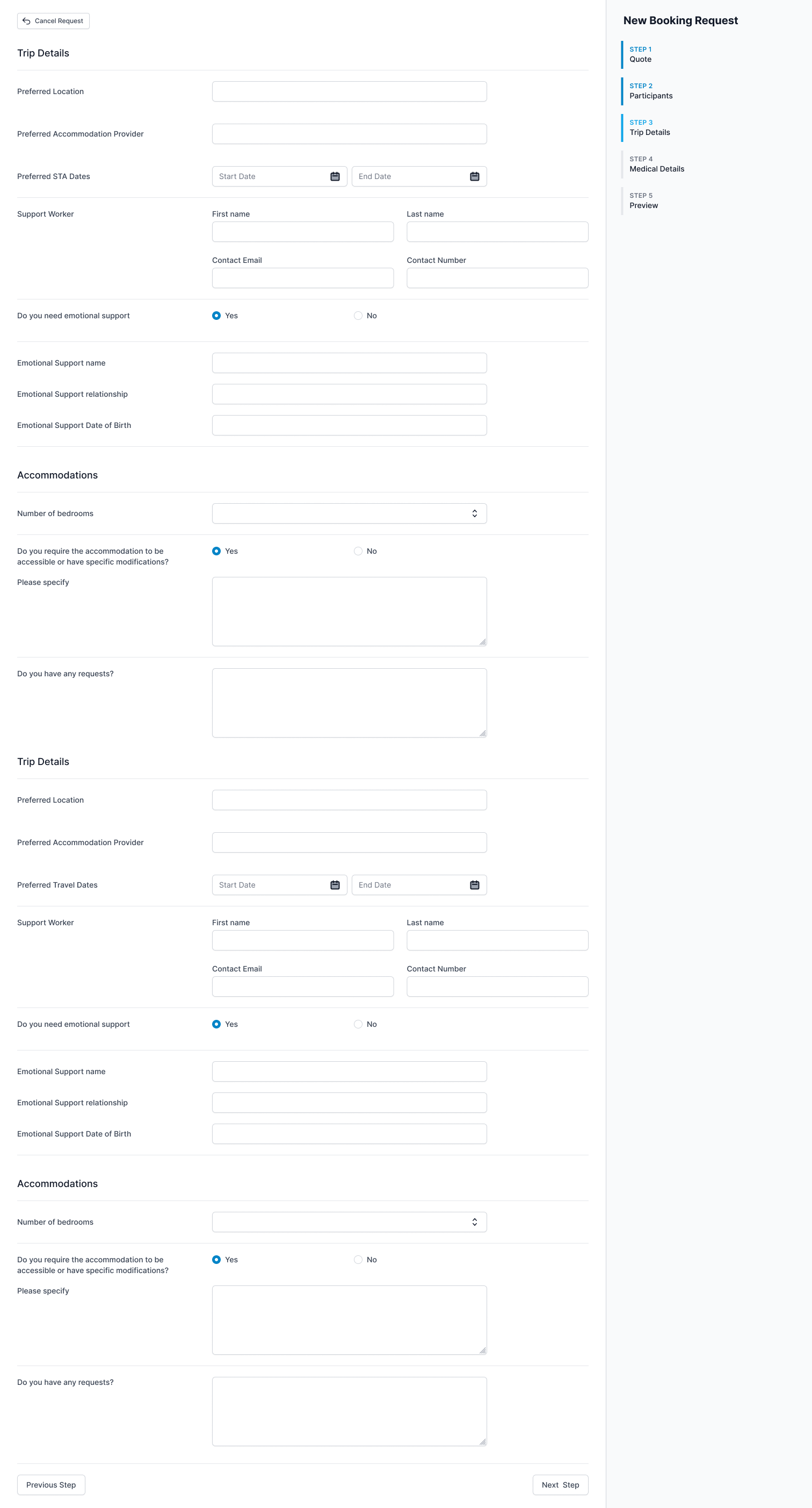
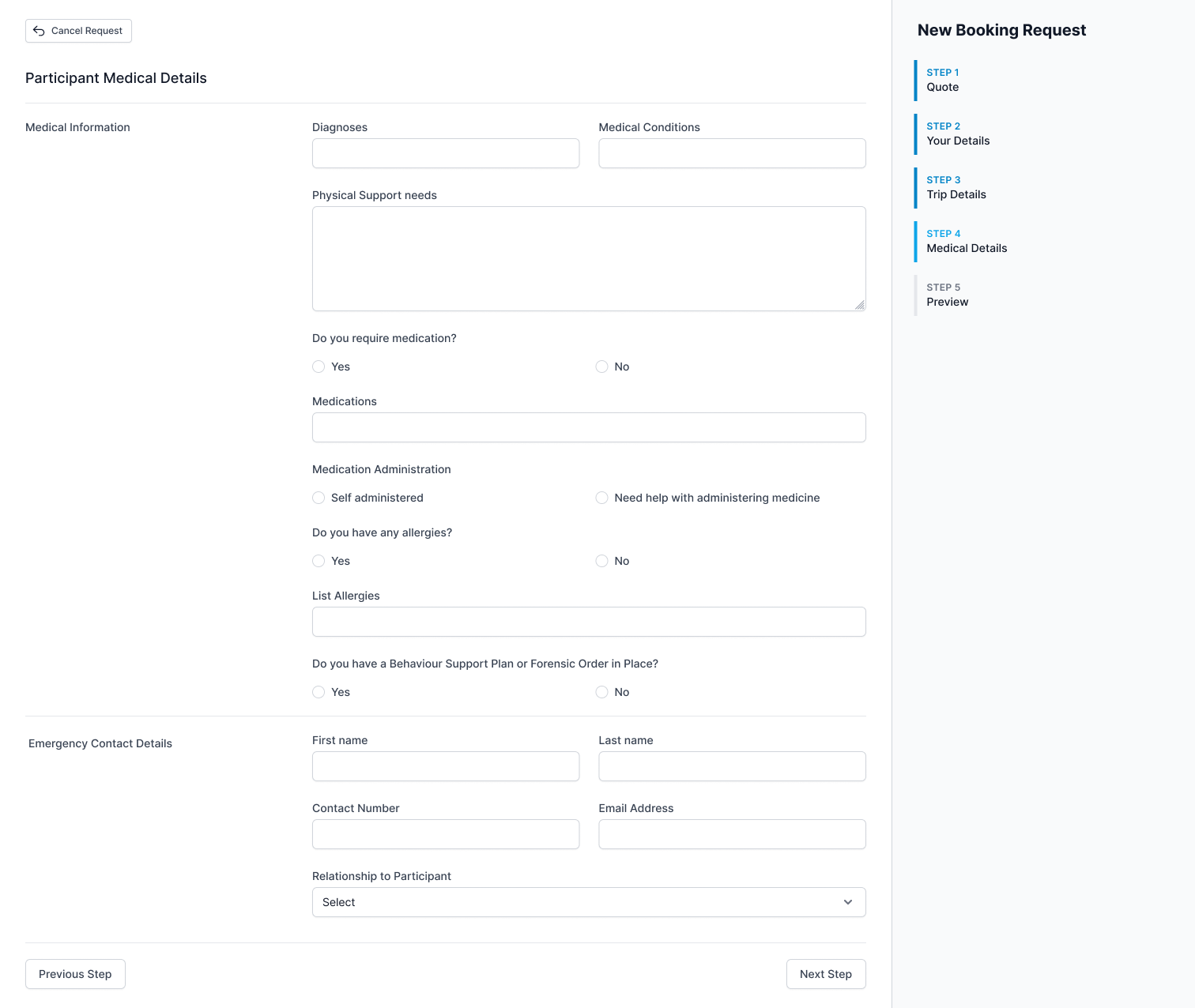
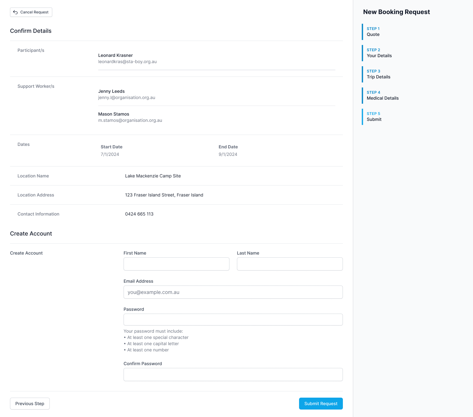
Roar Agency is a support agency for NDIS customers. The agency offers daily support care, community participation and social engagement support and Short Term Accommodation (STA) trip support for people with special needs. Roar Agency's founder, the client Lacy, wanted to make the STA booking experience much faster for customers looking to book travel via Roar Agency.
The major issue with the current booking system was that it was a complex, 4 step form that needed to be filled out by customers every time they wanted to book a trip via the agency. Even if a customer's details were saved in the agency's system, the form's required fields would prevent the customer from skipping sections to rebook. This lead to frustration for the customer and an increased amount of hands on support from the team just to get clients through the first steps.
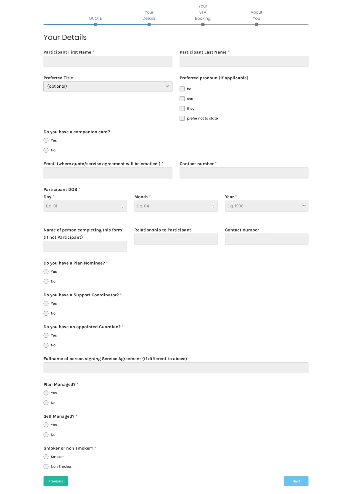
1 of 4 complex forms that needed filling each and every trip.
The Solution
A full featured web app for customers and administrators
Since the client knew that they wanted a new online tool for customers, my task was to provide insight into streamlining the user journey and providing an easy to use interface to facilitate a positive customer experience. My initial meeting with the client was to ascertain a list of all the stakeholders and objects required to make the system work coherently.
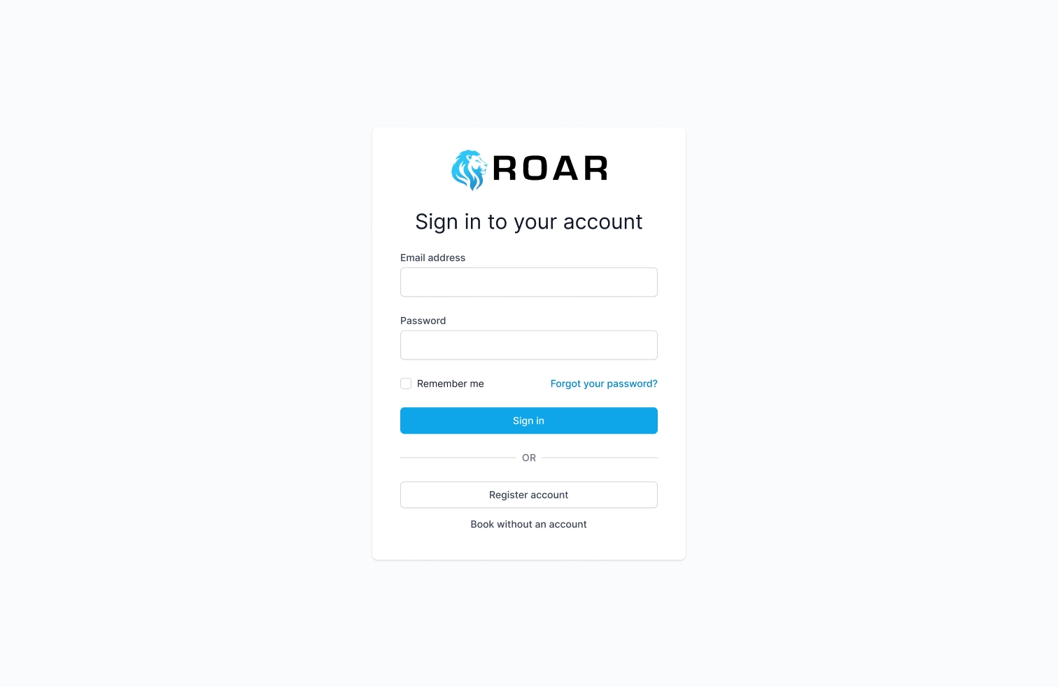
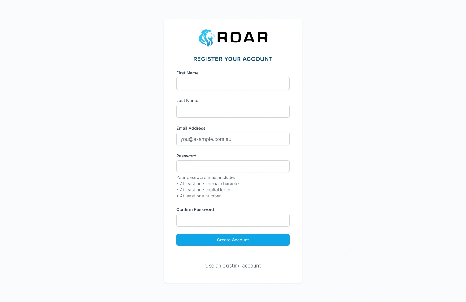
Once we had determined what the system required, my first goal was to make it as easy as possible for users to access the system and make a booking. Users would require an account to access the system so I built out a highly simplified login and registration screen with the additional option to make a booking request before signing up. This allows customers to postpone the account creation phase until after they have filled in a modified version of the booking request form.
I wanted to include this option to give the users who had already booked with Roar in the past a familiar path that they had used already, as the client had informed me that there are a number of their users who can find change to be difficult. This flow would let the user fill in the form that they are used to and then create an account as the final step.
Other than this addition, the login and registration were very standard and basic to allow the user access as quickly as possible. The user registration screen has clear password requirements that are explicitly stated to help eliminate confusion. The design of the login also allows for the addition of SSO options and passkey support in the future as needed by the client.
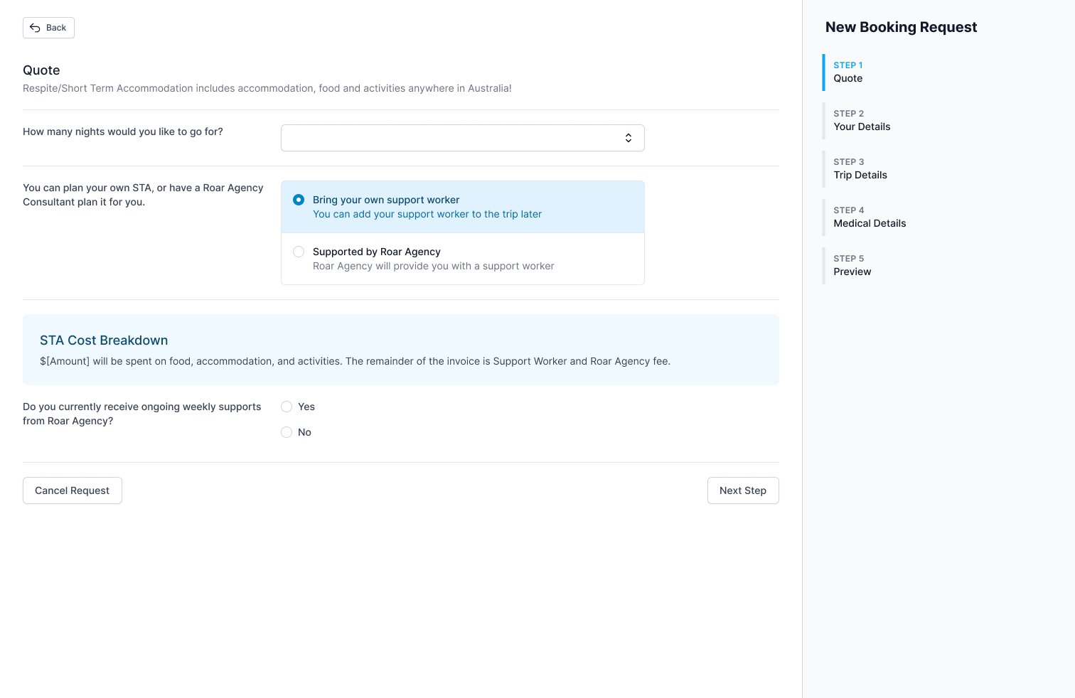
After a user has created an account and/or filled out their first booking request on the new system they are directed to the new dashboard. Depending on the route the user takes to get there they will either see an empty dash with relevant actions to booking a trip or the booking they requested in the onboarding trip flow.
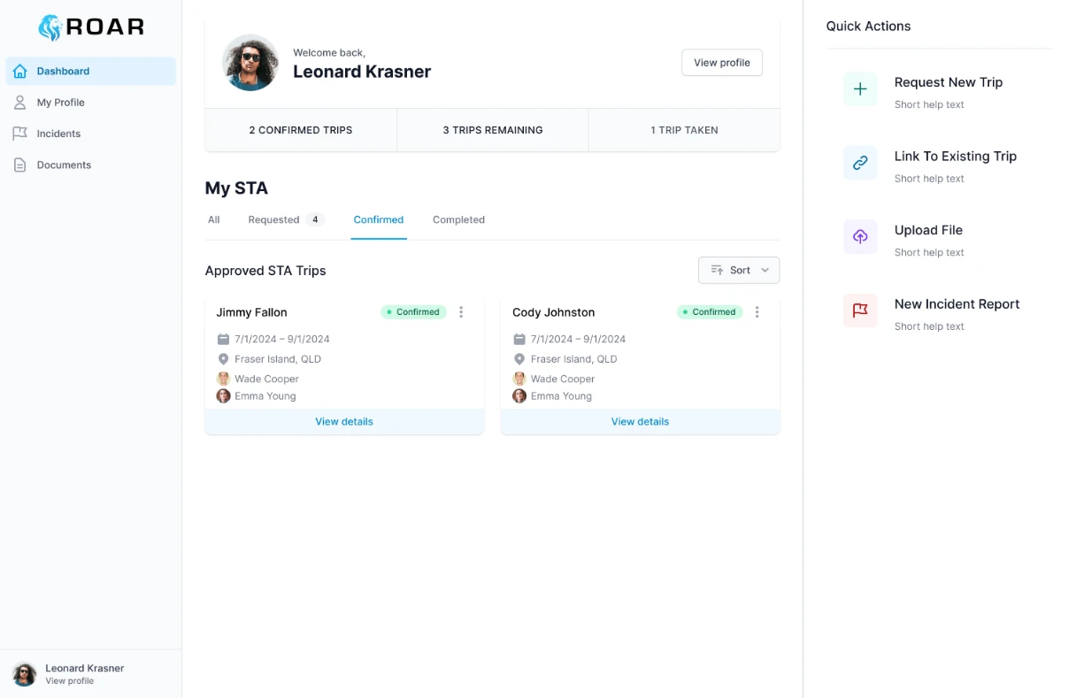
For the main user dashboard my primary goal was to reduce the amount of friction involved with making repeat bookings. It's not often that a user will have multiple bookings planned in advance so having a view that handles displaying lots of bookings at once isn't a strict requirement. This meant that the dashboard would be very bare if we only displayed a user's trips.
This led me to the decision to include a persistent Quick Actions toolbar on the right that has the most common actions that a user needs. I then added a profile card at the top of the dashboard so the user can quickly jump to their profile, as this is where important information for repeat bookings get set. I put multiple paths to the profile in place due to the importance of stored user information for a smoother booking process.